
Finding the Mark
How a simple design exercise led me back to the fundamentals of my work.
I’ve been thinking about creating a brand mark for rjostudio for some time. I wanted something distinctive that could work on my website, business cards, packaging and perhaps even a hat. But I didn’t want a conventional logo that simply arranged my initials in some clever way. I wanted something that connected to the work I make and the way I make it.
I’d been following the work of designer Allan Peters and was intrigued by his approach to creating memorable logos. He begins by exploring a wide range of ideas, then gradually eliminates and refines until he’s left with something simple and meaningful. It reminded me of my own process, where I begin with a limited vocabulary of geometric shapes and explore what happens when I change their relationships, proportions and colors.
So I decided to give his approach a try, using ChatGPT and Claude as design partners. What followed was a surprisingly involved exercise, with dozens of iterations, plenty of rejected ideas and a few discoveries about my own work along the way.
Exploring the possibilities
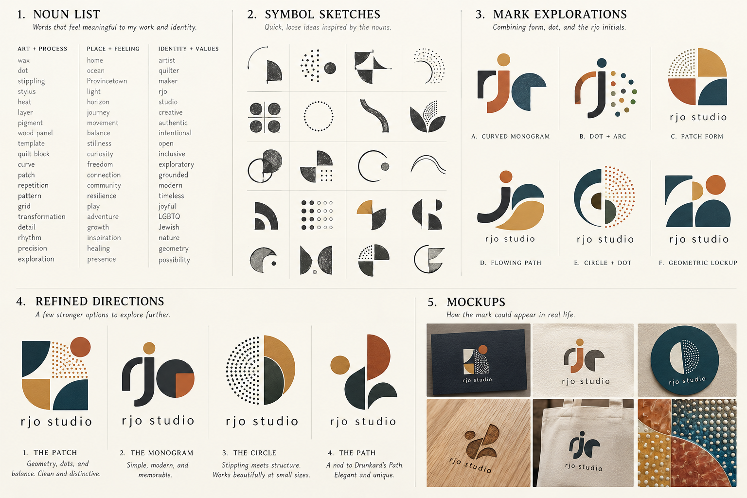
We began by identifying the words and ideas that define my practice: geometry, wax, stippling, repetition, quilt blocks, curves, pattern and movement. From there, we generated all sorts of possibilities. Some incorporated the initials rjo, others explored abstract symbols, and still others combined curves and dots into geometric compositions.
There were some interesting designs, but I kept coming back to the same question: what made any of these specifically mine? A nice arrangement of geometric shapes wasn’t enough. I wanted something that could be traced back to the way I actually work.
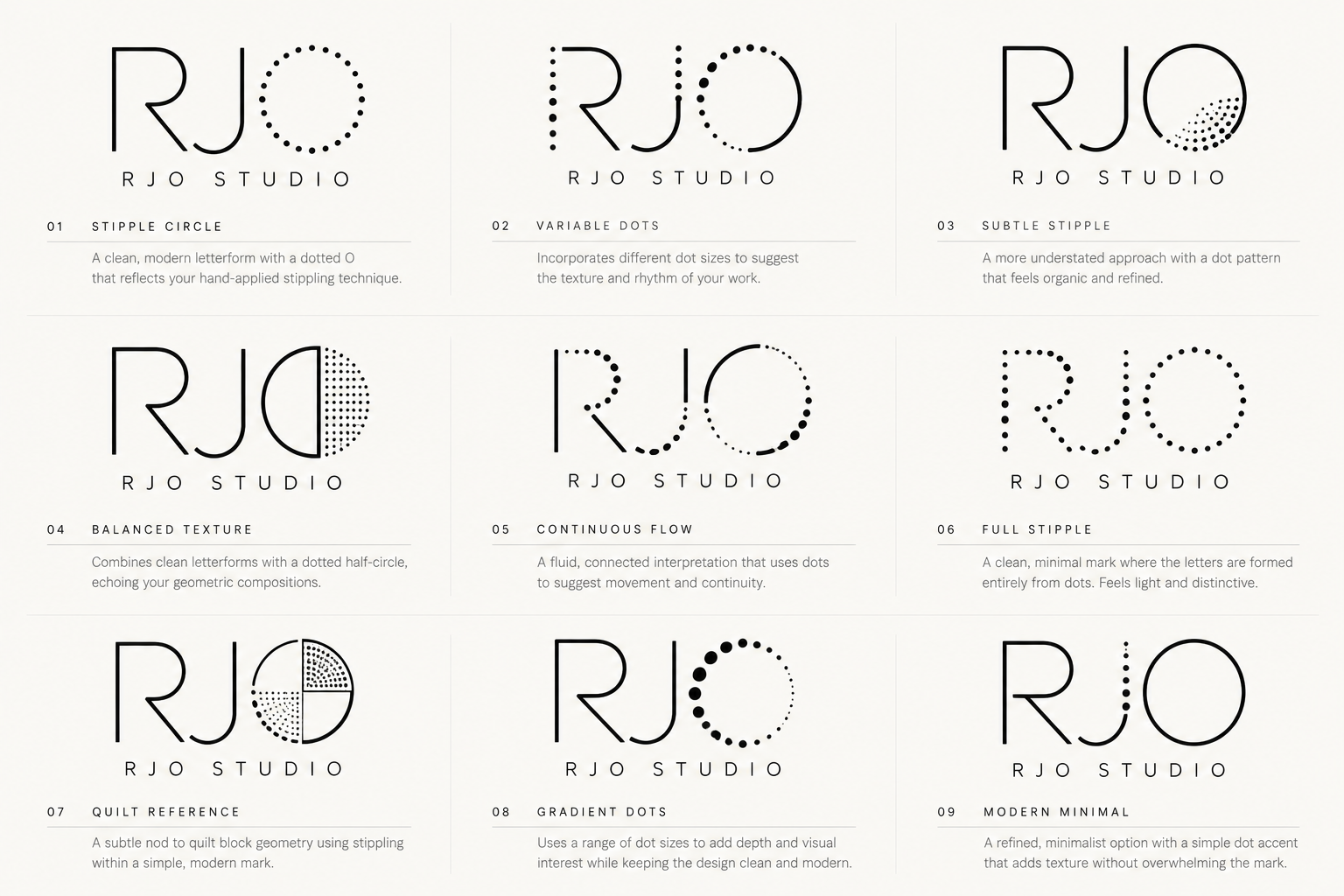
Since stippling is such an important part of my encaustic process, incorporating dots seemed like an obvious direction. We tried dotted circles, letters made from dots, gradients of dots and combinations of solid forms and stippling. Some looked good, but they didn’t feel right, and it took me a while to recognize why.
I don’t scatter dots randomly or cluster them together to create texture. I work from a template, placing dots at consistent intervals with a heated stylus. That regularity is part of what gives my paintings their structure. Once I recognized that distinction, it became easier to eliminate ideas. The dots couldn’t simply be a decorative reference to stippling. They needed to behave the way they do in my paintings.
Getting past the initials
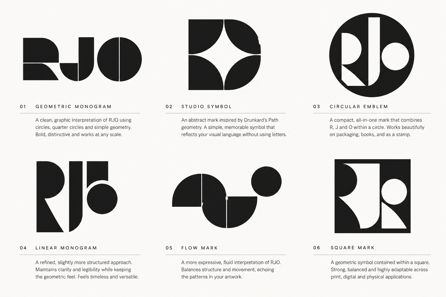
We also spent considerable time experimenting with the letters themselves. There were monograms, geometric letterforms, circular emblems and increasingly abstract combinations of R, J and O. Some were quite sophisticated, but they started to feel overdesigned. One thing that particularly bothered me was the use of uppercase letters. I’ve always used rjo in lowercase, and changing that made the identity feel heavier and more formal. It may sound like a small detail, but it was another example of something looking good without feeling right.
Eventually, I realized we were spending too much energy trying to make the initials interesting and not enough time thinking about what made the work distinctive.
Finding the connection
The breakthrough came when we returned to the Drunkard’s Path, the traditional quilt block that has become such an important part of my paintings. Its basic geometry, a quarter circle and the surrounding curved shape, gives me an extraordinary range of compositional possibilities. It’s the foundation for much of what I’ve been exploring in my recent work.
What if the mark combined that geometry with the regular pattern of dots I use in my encaustic technique? Rather than trying to illustrate a painting, we could borrow the underlying structure. That felt much more promising.
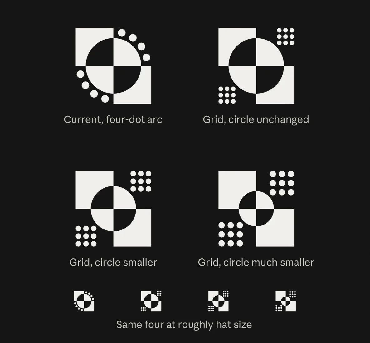
The designs became simpler and more deliberate. We began working with two opposing solid corners, a curved band of negative space and evenly spaced dots. We also started paying much closer attention to proportion. How large should the curve be? How much space should separate the elements? How many dots were necessary to establish the pattern without overwhelming the design?
One of the more interesting discussions involved the radius of the curve. My actual Drunkard’s Path template uses a proportion of approximately 87.5%, and initially I thought we should preserve that relationship. But when we compared it with a slightly smaller 80% radius, the difference was noticeable. At 87.5%, the solid corners became too thin and the dots began to dominate. At 80%, the curved negative space through the center became more prominent, and the relationship between the solid forms and the dots felt better balanced.
I found that particularly interesting. The most faithful reproduction of my geometry wasn’t necessarily the strongest design. We could preserve the underlying idea without reproducing every measurement exactly.
Getting the dots right
The earliest versions placed four dots along each curve, following the arc of the quarter circle. They were tidy, but they still read as decoration, sitting on top of the design rather than belonging to it.
The real shift came when we removed the solid quarter circles altogether and let two 3×3 grids of dots complete the square. Suddenly the dots weren't ornamenting the design. They were holding it up, the same way they build the surface of my paintings. The two remaining solid corners and the curved band of negative space between them now read as a single structure, with the dots doing half the work.
We also tried a lighter version with two 2×2 grids, thinking fewer dots might hold up better at small sizes. Then we mocked both up on a hat. The eight-dot version came apart into what looked like loose buttons, while the eighteen dots held together as one square. It was a useful reminder that a mark has to work in the world, not just on a screen, and that a physical test can settle a question no amount of looking at a monitor will.
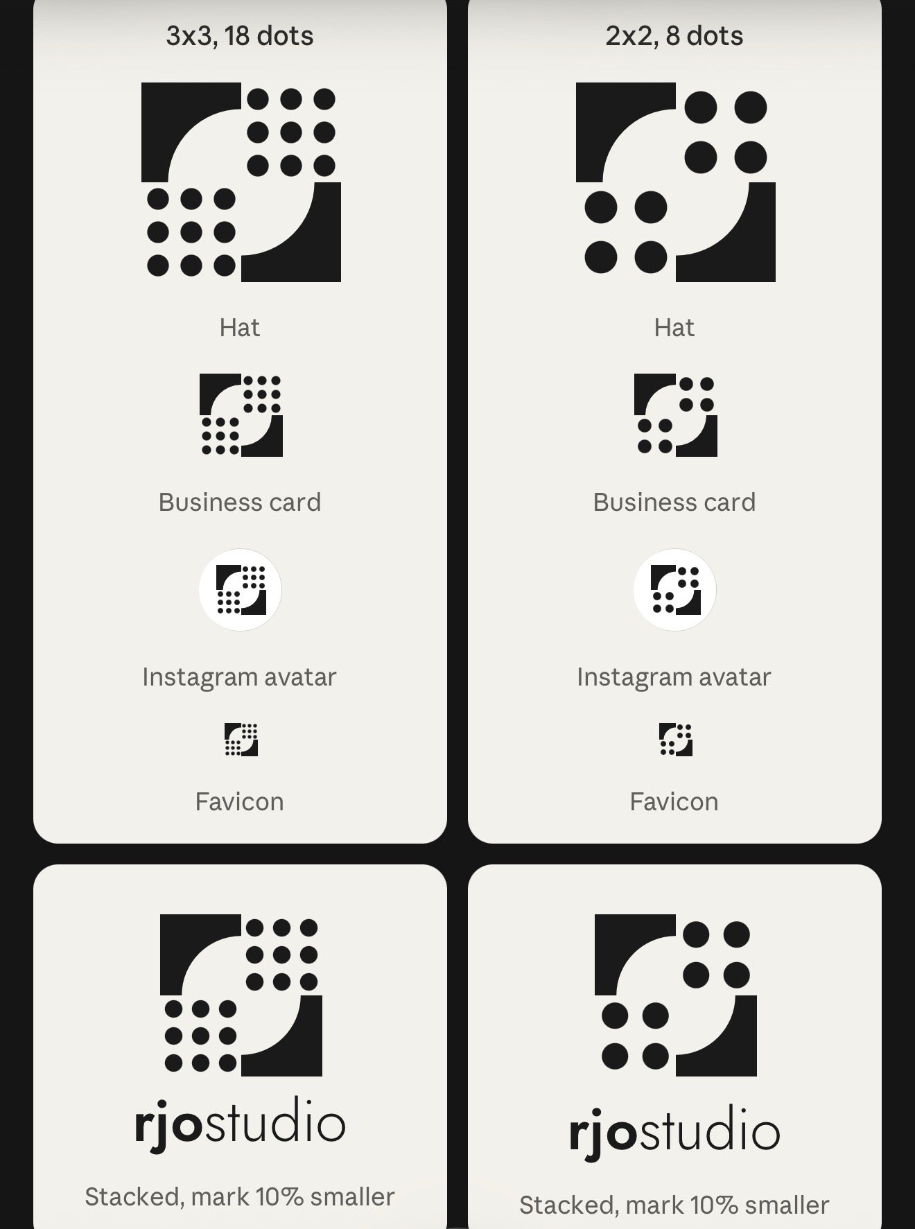
Moving to two 3×3 grids made a meaningful difference. The eighteen dots had enough presence to establish a rhythm, and their regular spacing created a much stronger connection to the way I work. Just as importantly, they balanced the visual weight of the solid geometric corners.
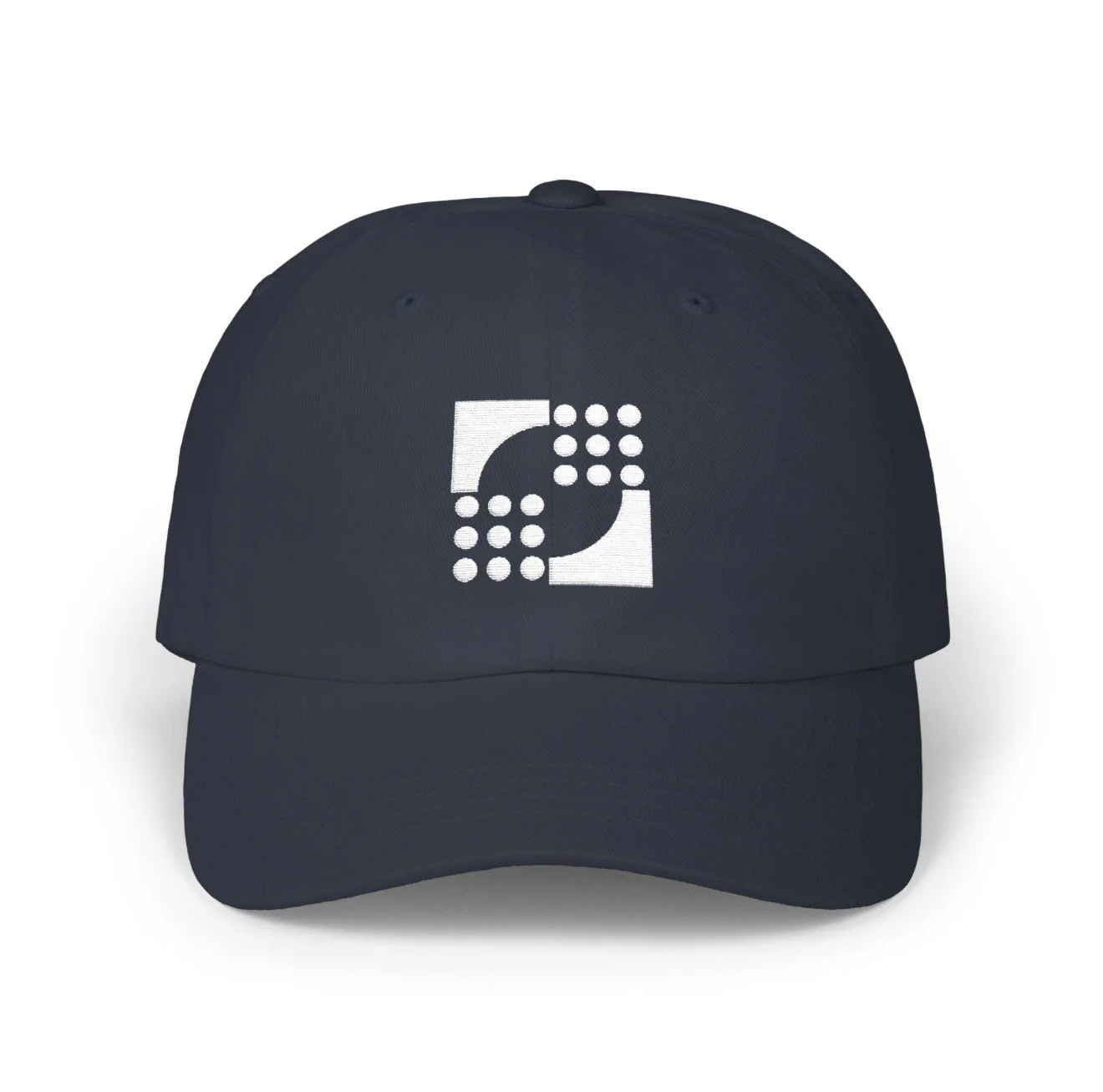
We tested the design on a hat, which was a useful reminder that a mark needs to work beyond a computer screen. The earlier eight-dot version helped us see how the design translated to embroidery, while the final eighteen-dot configuration brought us closer to the identity I wanted.
Where we landed
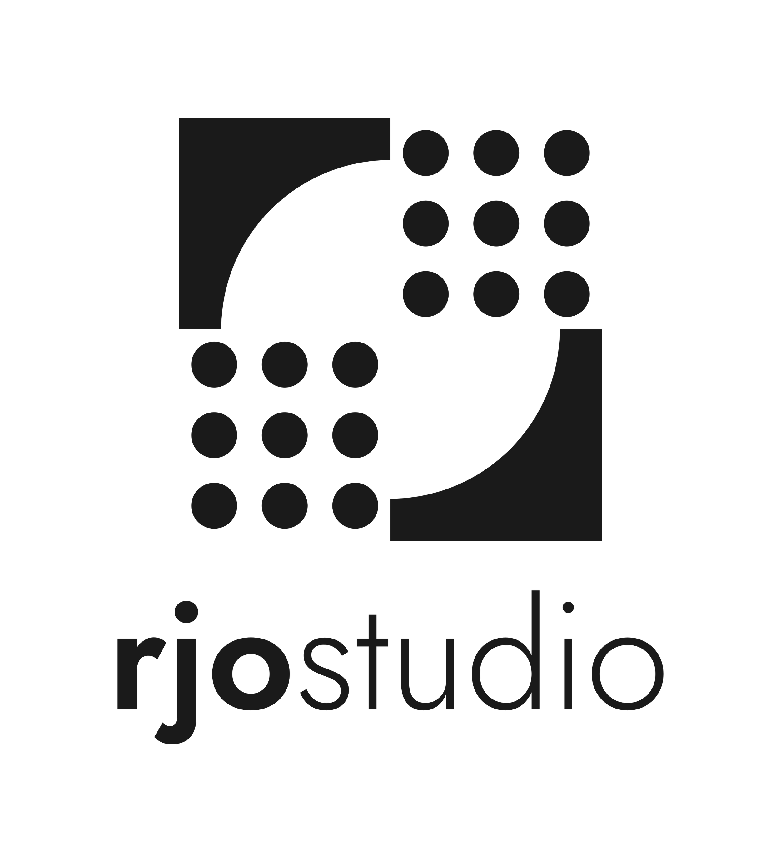
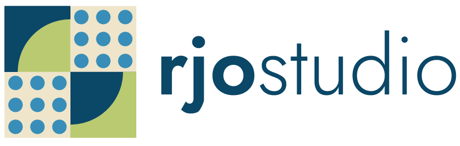
What I like about the final mark is that it doesn’t try to explain everything about my work. It brings together a few essential elements: the geometry of the Drunkard’s Path, the consistent spacing of my stippling and the relationship between solid forms and negative space. It’s simple enough to work across different applications, but it has a direct connection to how I make art.
We also developed stacked and horizontal versions, allowing the mark to adapt to different spaces without changing its underlying structure.

Looking back, I enjoyed the process more than I expected. There were plenty of designs that looked interesting but weren’t right, and figuring out why was probably the most valuable part. Each rejection helped clarify what mattered, and the final design is stronger because of all the things we decided to leave out.
I’ve been using the phrase “One block. Many possibilities.” in the artist book I’m developing about the Drunkard’s Path. It describes how a simple geometric structure can produce an almost endless range of compositions. After working through this exercise, I realize the same idea applies to creating a brand mark. You don’t necessarily need more elements to make something distinctive. Sometimes you just need to understand which ones matter.